


This exercise is Part 4 of 4 of the birthday data exercise series. The other exercises are: Part 1, Part 2, and Part 3.
In the previous exercise we counted how many birthdays there are in each month in our dictionary of birthdays.
In this exercise, use the bokeh Python library to plot a histogram of which months the scientists have birthdays in! Because it would take a long time for you to input the months of various scientists, you can use my scientist birthday JSON file. Just parse out the months (if you don’t know how, I suggest looking at the previous exercise or its solution) and draw your histogram.
If you are using a purely web-based interface for coding, this exercise won’t work for you, since it requires installing the bokeh Python package. Now might be a good time to install Python on your own computer.
Today’s topic is going to be about the bokeh plotting library. We create plots and charts to display and communicate information from data, and it would be great to do that directly from Python. Sometimes it is really nice to write code or algorithms from scratch to learn and practice, and sometimes, someone has already written the code so well that you should use theirs. Bokeh is one of these libraries - it is library specifically with functions for making plots, charts, and graphs. It is based on the famous D3.js library originally developed at the New York Times for their visualizations, which has been used for many years to programmatically create visually appealing data visualizations.
We use plots to convey information. From this histogram:
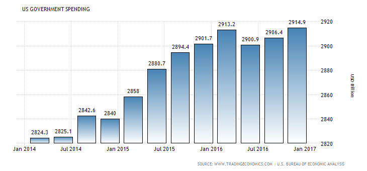
You can immediately see that the US government spending has been steadily increasing, reaching a peak in January 2017.
So learning how to make plots will help you become better at displaying and communicating information, both to yourself and to others.
If you are looking for a plotting library in Python, you have two main options: matplotlib and bokeh. Today I want to discuss bokeh, because I think it will become more popular in years to come.
Many Python developers (and especially data scientists and researchers) will tell you that the most commonly used plotting library in Python is matplotlib. I myself was a matplotlib user for many years - the integrations with Python data libraries are great, and migrating from the MATLAB plotting environment to matplotlib is easy. But a friend introduced me to bokeh and I was hooked ever since. Because it is based on D3.js, the visualizations look smooth and professional.
There is no one “best” plotting library - you should use whichever one feels and looks better for you. But for the rest of this post, I’ll talk about how to use bokeh to make a basic plot.
To use bokeh, we first have to install it. Unlike something like json or Counter from previous exercises, bokeh does not come installed with Python.
If you are using the Anaconda Python distribution (which you should, if you are on Windows!) then you can install bokeh by typing
conda install bokehin the Windows command prompt or the bash shell.
On OSX or GNU / Linux, just type
pip3 install bokeh(If you have are using Python 2, you should do pip install bokeh.)
The basic idea of any plotting package is simple:
So the first thing you have to do is prepare some data. Usually, when you are plotting data you have two axes, or groups of data, an x-axis (or horizontal axis) and a y-axis (or vertical axis). The x variable is your input (independent) variable and the y variable is your output (dependent) variable.
For use in bokeh, your data should be loaded into two separate lists, one for the x-axis and one for the y-axis. The basic format of a bokeh (in this case histogram) looks like this:
# need to import at least 3 things to make your
# bokeh plots work
from bokeh.plotting import figure, show, output_file

# we specify an HTML file where the output will go
output_file("plot.html")

# load our x and y data
x = [10, 20, 30]
y = [4, 5, 6]

# create a figure
p = figure()

# create a histogram
p.vbar(x=x, top=y, width=0.5)

# render (show) the plot
show(p)
The way bokeh outputs plots is really cool: when you run a piece of bokeh code, it outputs the result into an HTML file that you can then save and display in a web browser on it’s own. After you run this segment on top, it will automatically open a web browser and show you a plot.
One awesome feature of Bokeh is that it gives you a toolbar you can use to play with the graph - moving it around, zooming out, saving it, etc. Plus, you can put it directly into am HTML page!
It will look something like this:
The example above works when x is a numerical value. But, in the exercise, we are dealing with months, which is called a “categorical” variable (i.e. it belongs to a category, and is not continuous). To make sure bokeh draws the axis correctly, you need to specify a special call to figure() to pass an x_range, like so:
from bokeh.plotting import figure, show, output_file

output_file("plot.html")
x_categories = ["a", "b", "c", "d", "e"]
x = ["a", "d", "e"]
y = [4, 5, 6]

p = figure(x_range=x_categories)
p.vbar(x=x, top=y, width=0.5)

show(p)
Here’s what this one looks like:
There are also extra commands and arguments you can pass to bokeh to display an title for the plot, for each of the axis, for the color of the bars, and so on.
If you want to dive deep into that documentation, check out these resources:
If you want to add more flair to your histogram from this exercise, there are many resources on the web to help you out!
Happy coding!